Here is a guest post from a wonderful customer of ours - Roman Baczynski. It's a most enjoyable read, so be sure to give it a whirl. And once again, thank you to Roman for your time reviewing some of our products in stock 😊
I recently ordered some ink cartridges from the Hamilton Pen Company and I wanted to share what I found – so here goes….
Ink is important – and it’s fun!
You’ll have guessed I like writing with a fountain pen and ink is really important to me – there’s something about both the colour – I like bold and bright, not wishy washy – and the line – I prefer a strong, thick line. I think writing with a pen and having a distinctive colour of ink is a great way of expressing yourself, as well as being practical, particularly at work.
I write a lot of reports and prefer to edit the drafts the old fashioned way – I print them out and make corrections by hand. I find that I work faster that way and can jot down ideas, amend diagrams, strike out bad sentences and correct numbers far quicker than I could on screen.
I also mind map a lot – it’s a great way of structuring your thinking about complicated things and a fountain pen with free flowing ink really helps when you’re scribbling ideas down at speed.
My favourite colours
Anyway – I have two favourite colours that I use – both are Lamy Special Editions – Copper Orange (from 2015) and Vibrant Pink (from 2018). I spent a long time trying out different coloured inks and these two were my firm favourites.
I’ve used a lot of the Copper Orange since lockdown started and as I was running low, so I thought I’d better stock up. Hamilton was the only online shop I found that had stock of these, so I put in an order and was surprised to get a bonus of some other orange cartridges free with the order.
Now, I’m really fussy about colours, and was a tad reluctant even to try a new one out – I thought about all the different inks I’d tried before setting on Copper Orange as one of my go to colours, so anything else, well it would be like some kind of usurper.
I’m so glad I tried it - here’s what I found…
A strange new colour

The first thing I noticed was the colour. The colour on the box looked pretty much the same as the colour on the Copper Orange box, but when I put them side by side…well, it didn’t compare well with the Copper Orange (on the right) – in fact it looked weak and wishy washy.
It reminded me of the disappointment I had when I picked up Lamy’s Bronze ink last year, which was a paler version of Copper Orange and frankly lacked punch.
At this point, I wasn’t sure whether to go further. It hadn’t been a good start, but I thought I should carry on - after all, nothink ventured, nothink gained!
Choosing a pen

Yes, it has to be a Lamy – and the Lamy Safari is definitely my favourite pen. You can see I’ve got quite a few of them – at the time I was using the white pen for a standard blue and the black pen for Copper Orange. I’ve had the black pen for over 15 years now and the broad nib is nicely worn. The ink flows beautifully, giving a thick line when I write, which is lovely – wide and bold, whether it’s a straight line or loops, so it’s perfect for big handwriting like mine.
I decided that it would be the orange pen – no mistake then about which I’d put the strange ink into!
First day disappointments
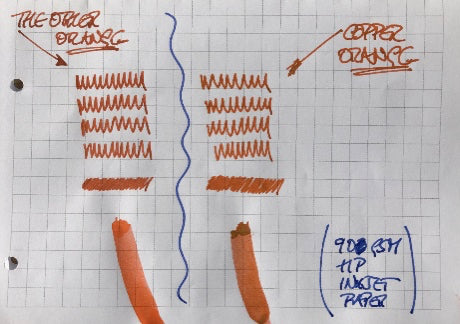
I did this first test quite late at night – I thought I’d do a simple comparison, a few squiggles and some close short lines to get a block. I was mighty disappointed – the Copper Orange had those dark coppery tones that I’d come to love, but this strange Usurper Orange (on the left) looked like it was trying to be similar, but had more of the copper tones, but too much and looked…well, just dirty.
I was pretty gloomy and wondered what would happen if I used a different paper.

I use recycled paper for printing my drafts, so I write a lot on this paper when correcting/editing, but also I use it as scrap, so I wondered whether the slightly grey tones in the paper might change the way it looked. Not really!
I then had a thought – the results just didn’t make sense. How could a colour that looks brighter in the cartridge be duller than the “proper” orange?
I needed to try something else!
The fog starts to clear
I put a small blob of ink on the paper straight from the cartridge and smeared it – I did the same on both papers to see if the paper made any difference. You can see from the blots that the colour of the Usurper Orange is far brighter.
Now, I thought I’d cleaned my orange pen out – I took the nib off and washed it, and I thoroughly wiped the feed with a tissue to make sure it was clean. I realised then that wasn’t enough and there was still some residue from an old ink in there and that was polluting the Usurper Orange ink.
There was only one answer – I’d be writing a lot in orange the next day – and I did have a big report to edit, so no problems there!
Orange inky joy!
The next day I wrote furiously to get through the cartridge and clear any residue out of the pen…and of course, edited the report. The results astonished me!


You can see in all three how the Usurper Orange has really come into its own. No coppery tinge – it’s a perfect, clear and bright orange line. In the daylight it’s almost like a dayglo orange from a highlighter. It really is a beautiful bright orange colour!
The best thing – and this is down to the ink, not the pen – is that the colour is consistently strong however wide or long the line is. If you look at the blue writing, you can see that the colour varies a lot – there are some lines or parts of lines where it’s paler, others, where it’s deeper.
Not with Usurper Orange – always the same colour, no faded bits – the same shade with no variations, whether it’s a straight line or loops in handwriting.
What was also interesting was the difference in the paper I used. The first, on the left, was a thick, smooth, well finished white paper, whilst the second white piece (the one on the right) was a cheaper, slightly less dense paper. I found that writing on the cheaper paper easier – the pen was gliding across the paper which almost felt like it was pulling ink from the pen. It was so much nicer to write on and the line came out a little wider that the better quality paper.
Although there’s a bit of bleed through with both the cheaper paper and the recycled paper, I think that’s a price worth paying for being able to write more smoothly and quickly.
Usurper Orange crowned as my new favourite!
Yes, after a day writing with Usurper Orange – it’s gone to the top of my list of Lamy cartridge inks – I’m definitely going to get some more!
Inkclusions
I’ve heard people say that you shouldn’t use old ink. I’m not an expert, but I’ve never had any problems with old Lamy cartridges. I’ve even used 10 year old bottled ink without problems.
There are always new ink colours coming out – Lamy are brilliant at releasing new colours every year, but some of the old ones are still pretty amazing, and my experience with Usurper Orange showed that its worth trying them out, because there are definitely some surprises out there.
Indeed, the Hamilton Pen Company still has a number of the older Lamy special edition inks available (July 2020), so it may be worth having your own exploration and seeing if you too could fall in love with one of these old colours in the same way as I did with Usurper Orange, which has definitely become my new favourite!
Happy inking!
Inky Thinker